How to Draw a Realistic Face in Pencil: A Nine Stage Guide
Learn how to draw a realistic face in pencil with a calm nine stage method that handles proportions, the Loomis crosshairs, and soft shading.
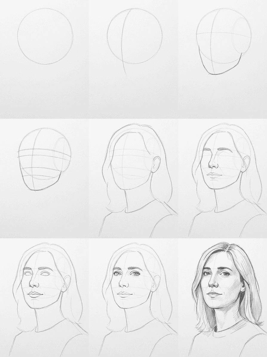
A finished portrait can look intimidating because every viewer knows what a real face is supposed to look like. The trick to learning how to draw a realistic face is to build the head in calm stages instead of chasing a likeness from the first line. This guide walks you through a friendly pencil portrait in nine stages, starting from a soft egg shape and ending with the darkest accents in the eyes. The reference is a studio shot of a woman in her thirties, which keeps face proportions honest and the lighting easy to read.

What you will need
Reach for an HB pencil for the early construction lines, a 2B for the first round of shading, and a 4B for the darkest accents in the hair and pupils. Anything softer than 4B smears under your hand on long sessions, so it is fine to leave the 6B in the drawer for this drawing. A small handheld sharpener and a strip of scrap paper to wipe the tip on are enough to keep the lines crisp from start to finish.
Medium-tooth sketch paper around 120 to 160 gsm holds the lines without tearing under an eraser. Smooth Bristol works too if you prefer a clean finish, although it shows every stroke, which can feel exposing while you learn. A kneaded eraser lifts graphite without leaving crumbs, and a small precision eraser cuts crisp highlights into the iris and the lip line.
Keep the kit minimal. A blending stump, a clip-on desk lamp with a warm bulb, and a small mirror to your right are the three biggest quality upgrades you can give a portrait drawing for beginners session. The mirror lets you check the drawing in reverse, which catches symmetry errors the eye learns to ignore after twenty minutes on the same page.
Why we break this into nine stages
Portraits fail when too many features land on the page at once. The nine-stage method spreads the work so each step asks one question, which is what makes this a beginner-safe face proportions tutorial instead of a leap of faith. You sketch the head shape, find the side planes, place the crosshairs for the features, and only then start drawing what people actually recognize. By the time you reach the eyes, the page already knows where the eyes belong.
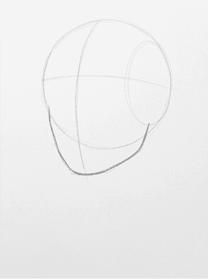
Stage 1, sketch the cranium and jawline
Start with the cranium as a soft, slightly squashed egg taking up the top two-thirds of your drawing area. Press lightly with the HB so the line is barely visible from a step away. Drop a short straight line from the bottom of the egg toward the chin point, angled gently for the jaw. The chin sits roughly one head-width below the brow. Keep this whole shape ghostly, because every later landmark will be measured against it.

Stage 2, map the side planes
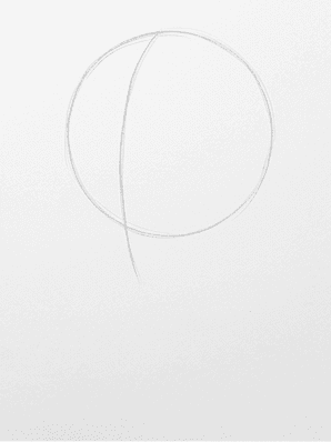
Now find the cheekbone on each side. Drop a soft line from the temple down to the corner of the jaw on the shadow side of the face. Mirror it on the light side. This is the draw a human face step by step move that turns a flat egg into a three dimensional head. Look at where the cheek catches the light in the reference, the side plane lives right behind that highlight.
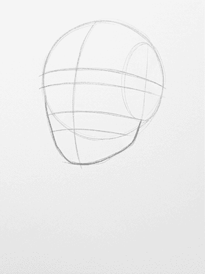
Stage 3, draw the Loomis crosshairs
Add the two lines that solve feature placement. The horizontal brow line crosses the head halfway between the top of the cranium and the chin, not a third of the way down. The vertical center line follows the slight tilt of the head and bisects the face. These two lines are the spine of realistic portrait pencil work, every feature you draw later snaps to one of them.
Stage 4, place the eyes and brows
Mark the eye sockets as two soft almond shapes sitting on the brow line. The detail beginners miss is the gap between the eyes, which is roughly one eye-width wide. Above each almond, sketch the brow as a low arched ribbon, thicker at the inner end and tapered toward the temple. Keep the irises as light circles for now, the value comes later.
Stage 5, add the nose, mouth, and hair mass
Drop the nose down from the brow line as a soft column, ending at the line you marked for the nose base. Sketch the nostril wings as small ovals on either side. The lip line sits about a third of the way between the nose base and the chin. Block in the hair as one large mass first, ignoring individual strands. The silhouette of the hair sets the gesture of the whole head.
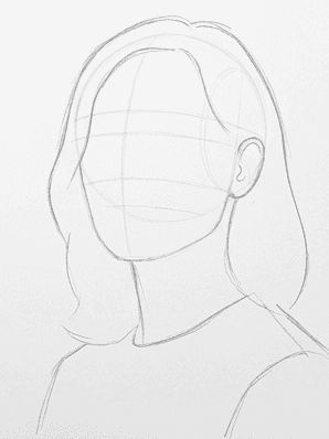
Stage 6, erase your guides and refine the outline
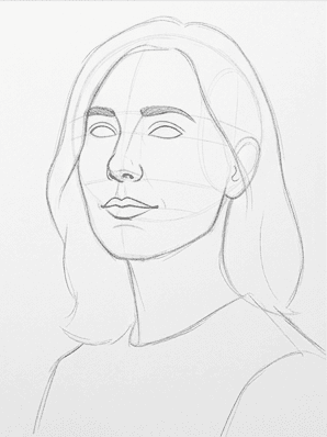
Lift the construction lines with a few light presses of the kneaded eraser. You only need to leave hints of the brow line, the nose base, and the lip line. With the structure lighter underneath, go back over the outside silhouette of the head, jaw, and hair using slightly firmer strokes. This is the first pass where the drawing starts to look like a person rather than a diagram.
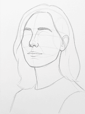
Stage 7, detail the eyes, nose, and lips
Now the small shapes earn their keep. Darken the upper eyelid line with a 2B, it is always heavier than the lower lid. Add the iris as a circle that touches the upper lid, and leave a small white triangle at the inner corner for the tear duct. Define the nostril shadows with two short curved marks, not full circles. Draw the line between the lips as a soft curve, slightly darker at the corners.
Stage 8, shade the shadow side
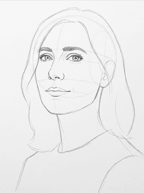
Switch to the 2B and lay down a light, even tone across the entire shadow side of the face. Work in short diagonal strokes, then blend with a stump until the area reads as one soft plane. The shadow falls along the temple, the side of the nose, under the cheek, and along the jaw on the shaded half. Leave the light side of the face almost untouched so the paper can do the work for the highlights.
Stage 9, add the darkest accents
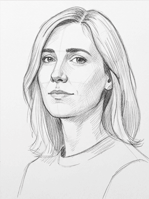
Reach for the 4B for the smallest set of marks that will do the most work. The pupils, the inner edge of the upper eyelid, the deepest part of the nostril, the corners of the mouth, and the cast shadow under the chin all want this darkest value. Add a few dark hair strokes to break the hair mass into shapes. Step back from the page before you commit, the eye reads contrast first.
Common mistakes
The first failure mode is drawing the eyes too high on the head. The brow line sits at the vertical center of the cranium, so most beginners stack the features into the top half of the face. Lay your finger across the page, if there is not as much room above the brow as below the chin, the eyes are too high. Erase the brow line back to center before you continue.
The second failure is committing to a feature before the framework is in place. The reference is patient. Resist the pull to perfect an eye in stage four before the nose and lip line exist. A small fix is to put the pencil down between stages and walk around the room for ten seconds, you will spot the structural error you missed sitting still.
The third failure is overshading the light side. Soft shadows on the light side of the face flatten everything you built in stages one through six. If the face starts to look gray and tired, lift the lightest areas with the kneaded eraser and let the bare paper carry the highlights.
The fourth failure is overworking the hair before the face is done. Hair is forgiving when the head underneath is right, and unforgiving when the head is wrong. Finish stages one through eight on the face before you commit a single strand.
Practice prompts
Try the same head in a frontal view next, with both eyes catching the same amount of light. Frontal faces are harder because symmetry is unforgiving, so use a ruler to drop the center line for the first few attempts and trust the Loomis crosshairs from stage three.
Then redraw today's reference under a different light. Imagine the same studio with a warm low evening sun coming from the right instead of soft daylight from the left. The cheekbone plane that was in shadow today now picks up the light, which forces you to rethink stage eight before you start.
Finally, swap the subject for an older or younger face using the same nine stages. The framework does not change, only the surface details do, which is the whole point of a portable face proportions method.
Pencil portraits get easier the moment you trust the framework. Print your reference at the size of your final drawing, hang it next to the page, and run the same nine stages once a day for a week. By day three the early scaffolding will feel automatic and your eye will catch proportion errors before your pencil does. If you want this same nine-stage workflow on your own photos, install the Learn to Draw app on iOS or Android and feed it a portrait you actually want to draw.